Ever feel like you’re drowning in paperwork, invoices, and emails asking, “When are we paying this vendor?”
If you work in accounts payable (AP), you know exactly what we’re talking about. The more vendors, transactions, and payments you have to manage, the messier things can get.
Plus, with so many moving parts to keep track of, it can be difficult to get a clear picture of your AP department’s performance.
And this is where an accounts payable dashboard can come to the rescue. Once it’s in place, you’ll quickly realize how much simpler life can be without the constant back-and-forth chaos.
But first, what exactly is an accounts payable dashboard and what is so special about it?
Think of it as the control center for your AP team. Instead of scrambling between spreadsheets and emails to figure out what’s due, who needs to be paid, and how much cash you have, an AP dashboard consolidates all that information into one easy-to-navigate view. It’s like having your entire AP process on one screen – neatly organized and ready for action.
You get the picture. Now, the question is: how do you create one that suits your needs?
Read on, because in today’s post, we’ll dive into how this handy tool can completely transform the way your team handles invoices and payments – and why it’s a game-changer for efficiency.

AP Dashboard: The Control Center of Your AP Operations
AP dashboard is your all-in-one tool for tracking and managing every aspect of your AP processes. Whether you need to review invoices, manage vendor information, or keep an eye on payments, everything you need is accessible at a glance.
Having a centralized location for all this data not only keeps things organized, but it also enhances communication and decision-making. And with customizable features, you can tailor the dashboard to fit your specific needs and preferences.
For the AP team, a comprehensive and personalized AP dashboard is more than just a handy tool – it’s essential:
- Provides a clear, immediate overview of all outstanding payables
- Helps maintain control over the organization’s cash flow
- Offers an up-to-date view of payables
- Enables quick spotting of discrepancies
- Helps prioritize payments
- Assists in avoiding late fees
- Leads to more efficient and cost-effective operations
But it’s not just about numbers; a robust AP dashboard contributes significantly to the overall financial health of the business, empowering the AP team to support growth and stability.
How to Customize Your AP Dashboard to Best Suit Your Needs
Customizing your AP dashboard isn’t just about aesthetics – it’s about making the data work for you. By focusing on the right metrics and leveraging your software’s capabilities, you can create a dashboard that not only keeps you organized but also enhances your overall financial strategy.
A one-size-fits-all approach won’t cut it when managing finances. So, let’s break down the key elements and metrics you should consider for your dashboard, along with insights on how different ERPs and accounting software offer unique customization options.
Customization Options in Different ERPs and Accounting Software
The flexibility you have largely depends on the ERP or accounting software you’re using. Each AP solution offers unique features and settings that allow you to customize your dashboard to create a view that works best for you.
Here’s how some popular options differ:
- Cloud-Based Solutions (like QuickBooks or Xero): Cloud-based platforms typically feature user-friendly interfaces with drag-and-drop customization. You can easily add or remove widgets to display the metrics that matter most to you.
- Comprehensive ERPs (like SAP or Oracle): ERP systems often come with advanced reporting and analytics capabilities. While they allow for deep customization, you might need more technical expertise to fully take advantage of their features. These systems let you build complex dashboards tailored to different departments or specific user roles.
- Industry-Specific Software: Some software solutions are designed for specific industries (like construction or healthcare) and offer tailored metrics for those fields. Customizing these dashboards can give you insights that are particularly useful for your unique business model.

8 Key Elements and Metrics to Include in Your AP Dashboard
The key to creating an efficient AP dashboard lies in displaying the most critical data in a way that’s easy to understand and act on.
To help you decide what data to include, here are the essential elements and metrics that should be front and center, along with a detailed explanation of why they matter and how customizing them can provide insights beyond the basics.
- Outstanding Invoices
- Payment Status
- Cash Flow Projections
- Vendor Performance Metrics
- Budget vs. Actual Spend
- Aging Reports
- Payment Trends Over Time
- Dispute Management
1) Outstanding Invoices
This is the backbone of your AP operations. Keeping track of outstanding invoices ensures you know what’s due at any given moment, helping you avoid missed payments or late fees. It also helps you manage vendor relationships, maintain good credit terms, and prevent cash flow issues.
- How to customize: Your AP dashboard should allow you to sort or filter invoices by parameters like vendor name, due date, invoice number, or amount. For example, you might group invoices due within the next seven days to ensure they’re prioritized. You could also highlight high-value invoices or categorize them by currency if managing international payments.
2) Payment Status
Knowing the status of each payment is essential for tracking your AP workflow. This section of the dashboard shows you, at a glance, where every invoice stands – whether it’s been approved, is pending, or has been paid. Payment status helps manage internal approvals and keeps your team aligned on what needs to be processed next.
- How to customize: You could set up a visual tracker with color-coded status indicators: red for overdue payments, yellow for pending approvals, and green for completed payments. You can also break this down further into different stages, such as invoices awaiting approval, payments in process, or checks waiting to be mailed.
3) Cash Flow Projections
As they say, “cash is king,” and projecting your cash flow helps ensure you have enough liquidity to cover your expenses. By displaying your future cash needs based on outstanding invoices, your dashboard can help prevent financial surprises.
- How to customize: Ideally, you want to include visual charts or graphs that project your cash flow over the next 30, 60, or 90 days. These projections should automatically adjust based on real-time invoice data, showing how upcoming payments will impact your available cash. Customizing this feature to pull data from different accounts or timeframes allows you to better plan for lean periods or identify opportunities to negotiate payment terms that align with your cash flow.
4) Vendor Performance Metrics
Not all vendors are the same. Some may offer early payment discounts, while others might be more flexible with payment terms. Tracking metrics like how quickly you pay each vendor, whether you’re taking advantage of discounts, or how often vendors miss their own delivery deadlines can provide valuable insights into your operations.
- How to customize: Set up metrics that measure vendor efficiency, such as the average time it takes to pay them or how frequently you utilize available discounts. Add filters to sort vendors by payment terms, amounts paid, or missed discount opportunities. This makes it easier to spot trends or identify areas where you could negotiate better terms.
5) Budget vs. Actual Spend
Staying on budget is crucial for any business, and this metric allows you to track your actual spending against what you’ve budgeted for. It highlights areas where you might be overspending or where there’s room for savings. Monitoring this in your AP dashboard ensures that your financial goals align with your spending patterns, preventing costly oversights that could hurt profitability.
- How to customize: Use bar graphs or tables to show how much has been budgeted for each expense category (for example office supplies, inventory, contractor fees) and compare it against actual spending. You can also set up alerts to notify you when spending in a particular category exceeds a set threshold, providing real-time feedback on how well you’re sticking to your budget. This metric can also be customized for specific projects, helping managers stay on top of their allocated funds.
6) Aging Reports
Aging reports provide a snapshot of how long invoices have been outstanding, broken down into categories like 0-30 days, 31-60 days, 61-90 days, etc. Monitoring the age of unpaid invoices helps prevent overdue payments and penalties, giving you a clearer picture of your liabilities.
- How to customize: Customize your aging reports to flag invoices that are approaching their due date or have already become overdue. Set up automated alerts for invoices that reach a specific age threshold, allowing your team to address these items before they impact vendor relationships or incur late fees. Depending on your dashboard’s capabilities, you can further customize this by vendor, payment terms, or invoice value to prioritize critical payments.
7) Payment Trends Over Time
Understanding the patterns and trends in your payment activity is essential for forecasting and budgeting. For example, you may notice spikes in outgoing payments at the beginning of the month due to recurring expenses, or seasonal increases in spending during busy periods.
- How to customize: Set up historical trend graphs to display your payment history over different periods (monthly, quarterly, or annually). By comparing timeframes, you can analyze when higher payment volumes typically occur and adjust your cash flow planning accordingly. Customizing the view by category or department can also help you understand which areas of your business are driving the most costs.
8) Dispute Management
Occasionally, discrepancies arise between an invoice and what was delivered or agreed upon, leading to disputes. Including a dashboard element that tracks these disputes allows you to stay on top of unresolved issues with vendors.
- How to customize: Your dashboard can display the number of disputed invoices, their status, and how long they’ve been unresolved. You can also prioritize disputes based on the amount in question or by vendor, ensuring these issues don’t linger and disrupt business operations.

Best Practices for Designing Your Accounts Payable Dashboard
Identify Key Metrics
Before diving into the design of your dashboard, take a moment to identify the AP key performance indicators (KPIs) that matter most to your business. Think about the metrics you currently track and consider which ones would provide the most valuable insights into your accounts payable process.
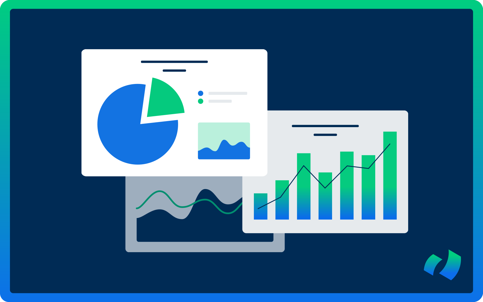
Use Visualizations
Dashboards thrive on visual representations like charts, graphs, and tables. It’s essential to choose the right type of visualization for each metric to effectively convey the data. For instance, you might use a bar chart to show the total amount of invoices processed over time, while a pie chart could illustrate the percentage of on-time payments versus late payments.
Categorize Data
Organizing data into categories can significantly simplify interpretation and analysis. In AP, this could mean grouping suppliers by industry, payment terms, or invoice type. Doing so allows you to quickly identify patterns and trends in your spending and payment processes.
Real-Time Data Updates
An effective dashboard should provide real-time updates on key metrics. This feature keeps AP teams informed about the current state of their processes, enabling them to make timely adjustments as needed.
Use Filters
Filters are a handy tool that lets users customize the displayed data based on specific criteria. For example, you could filter invoices by date range, supplier name, or payment status.
Incorporate Drill-Down Functionality
Drill-down functionality lets users click on a specific data point to access more detailed information. In the context of AP, this might mean clicking on an invoice total to see a breakdown of individual line items. This feature provides deeper insights into the data, helping to pinpoint any discrepancies or errors.
Implement Alerts
Setting up alerts in your dashboard can notify you of any unusual or significant changes in the data. For instance, if there’s a sudden increase in the average time taken to process invoices, an alert can trigger an investigation to address the issue promptly.
Consider Mobile Accessibility
With the growing use of mobile devices, it’s crucial to design dashboards that are accessible across various platforms. This ensures that the team can stay updated on AP processes while on the go, enabling them to make informed decisions from anywhere.